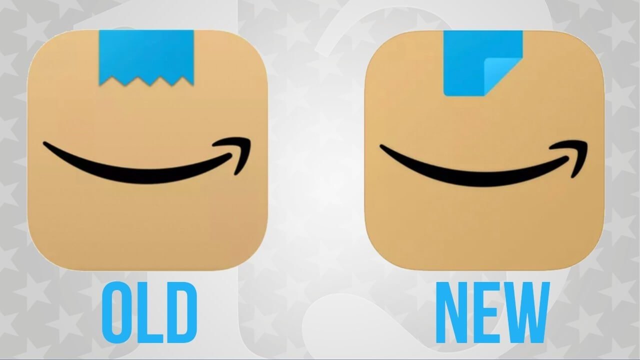
The E-commerce giant Amazon App Icon Changes after it drew some unfavourable comparisons. Amazon replaced the blue ribbon on top of the App icon after receiving feedback that it resembled Adolf Hitler’s moustache, reports Fox News. The Amazon company had unveiled a new icon in January, replacing the old and familiar shopping cart icon with a brown cardboard box that features a blue ribbon on top and Amazon’s signature arrow in the shape of a smile below it. This was Amazon‘s first change to its app icon in more than five years.
Why did Amazon Change their App icon?
However, the jagged piece of blue tape reminded several social media users of Adolf Hitler’s toothbrush-style moustache. Many users took to social media platforms like Twitter, Facebook, Instagram to point out the resemblance. After receiving user feedback, Amazon quietly tweaked the app icon to replace the jagged blue tape with a straight one. The replaced icon still features the blue tape on top, but without the jagged edge.

Did Amazon Change their App logo?
lmao I completely missed that amazon quietly tweaked its new icon to make it look… less like hitler pic.twitter.com/Jh8UC8Yg3u
— alex hern (@alexhern) March 1, 2021
NEW: @amazon changes their app logo after comparisons are made to Hitler
🧚♀️ pic.twitter.com/8QAjzQ5HwC
— the big fellow (@borderfox116) March 2, 2021
“We designed the new app icon to spark anticipation, excitement, and joy when customers start their shopping journey on their smartphone, just as they do when they see our boxes on their doorstep,” an Amazon spokesperson said to CNN.


